Monday, August 22, 2011

MUDD 5050

The purpose of this blog will be to document the work I'll be doing as a graduate student in the Master of Urban design program at UNC Charlotte's School of Architecture. As a recent graduate from UNC Greensboro's Interior Architecture program, I have interiors, graphic, and architectural design experience. You can view my previous work through the side button links. As a new graduate student entering the Master of Urban Design program from a non-accredited architecture program I was required to take the summer course MUDD 5050, which is an basically an intro to design studio. The class started out with the individual assignment diagramming a box within another box to define the typologies: l-shaped, u-shaped, centralized and divided.
From those diagrams in groups of two we chose one of each of the four typologies from our combined work and went on to draft on trace these diagrams of the box within a box of a room within a space. Adding an threshold and apertures to the rooms to strengthen the typologies.

We then built basswood models of the four types and did light studies of them using the heliodon in the Lighting Lab, photographing them at different times of the day and different days of the year.

From those models we went back to doing individual work and each chose one of the typologies from the models we did and built a larger scale foam core model. I chose to continue with the divided typology. The plan illustrates division of the space in quadrants, and the apertures and thresholds help strengthen the typology.


We also did orthographic drawings of this final space.


With the larger scale model we built, we did another light study in the Lighting Lab, this time using the artificial sky and the online WEBHDR software.

With the image that was generated from the HDR photo studies, the next assignment was to make an abstract collage in photoshop to represent the idea of division. At this point the room wasn't meant to serve a purpose functionally, so we had to illustrate in the collage who might use the space, how might material affect it, and where might the box be located. This collage was a really fun assignment to do! It was very abstract and really just meant for you to tell a story of your space while represent your idea.

So! With the idea of division, the apertures and thresholds really signify the different spaces created within the quadrants, which is what led me to do this collage. It basically tells a story of a person who wants to explore and this room could sort of be a capsule which enables them to do that. From one extreme of exploration to another, as far as outer space and as deep as the ocean. Below is our final presentation!


During the previous assignment we took a break mid way and had an assignment of graphically representing data. This data was collected prior to class starting earlier in the summer and we had to account for every 30 minutes from Monday-Sunday. Each person used a different persons data to represent.


Allllllllllll that within the first 3 weeks of the class!


Our final project was based around our five-day class trip to Charleston, South Carolina and Savannah, Georgia. In Charleston we stayed at the Inn at Middleton Place, a contemporary inn on the grounds of Middleton Place, which has a historical landmarks and gardens. We also stopped in-between the two cities in South Carolina to do some charcoal drawings of the Sheldon Church Ruins, which was an old church from the mid 1700s. Below are some photographs taken on the trip, I apologize for the layout of the photos below...I couldn't organize it nicely!


The Inn & Gardens at Middleton Place

The Sheldon Church Ruins, SC


Charleston, SC


Savannah, GA


Our final project was to design an emergency shelter.

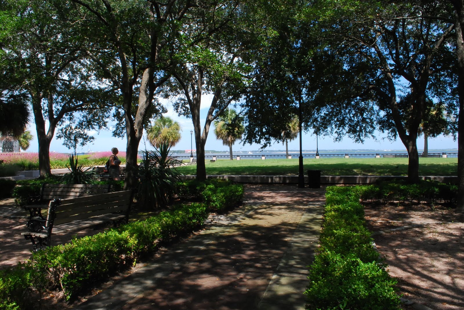
We had two sites to chose from to do our project. One was a waterfront park in Charleston and the other was one of the squares in downtown Savannah. Below are the photo analyses I did for both of the sites.

Study of light & shadow, Charleston site

Surrounding city "thresholds", Charleston


So, for my project I chose to do the Savannah site, Oglethorpe Square. Savannah's riverfront downtown is made up of park like squares about every other block. Below are the photo analyses & diagrams of the site I've created.

City Context

Landmarks Diagrams, Savannah, GA
Elevation Diagrams, Savannah, GA

Savannah diagram analysis, Oglethorpe Square & other surrounding squares

Oglethorpe Square Panoramic


My next post will show my process & final images for the MUDD 5050 project, and that'll conclude the summer semester assignments. After that I'll be blogging about the projects, assignments, & thoughts as a graduate student in the Master of Urban Design program, so keep following! :)


Sunday, May 3, 2009

final axon of this ginormous building

final cafe-market images

This perspective is of the cafe-serving area, the bikelane runs overhead,  the back area is a more private cafe-seating area, and the left walkway leads to the auditorium and quietroom.
This perspective is of the seating-market area.  You can see the bikelane running overhead, the mini-farmer's market along the left, and the cafe-serving area in the back.

In this perspective you see more private seating on the right, looking out onto the lee st side of the building. Here you also get another view of the bikelane overhead, the market, and the other seating on the side.

Wednesday, April 8, 2009

. cafe+market ideas .

ideas for the cafe-market! our whole building a very narrow so space planning definitely posed some issues with the cafe-market, and finding enough space for the kitchen, serving areas, and the seating. the bike lane goes right through the cafe market, so I decided to celebrate it rather than try to hide it.  the bike lane creates acceleration and movement and I think that it can really create an exciting space.  in this above image I decided to have an "exit" for the bike lane above so those riding can stop at the cafe-market, and I also decided to add some seating above for more space and to be more interacted with the bikelane and the movement above. 
In this image I decided to incorporate these curved panels that Stacy found interesting and was thinking about using in the bookstore and so I tried to tie that in here in my space where the ceiling height will be lower below the overhead bike lane.
In these drawings I was brainstorming and kind of semi-programming the cafe-market a little bit more and testing different forms for the space.
In these drawings I was trying to invision the bikelane going through the cafe-market and trying to see what kind of energy and feelings it creates. i also was experimenting with different kinds of spaces for the fresh-market.

updates

Here is a diagram of the cafe/market and it's relationship to the core and the bikelane
this drawing is a possible way to transition from the site into the building's bikelane. instead of a door on the building to allow entry for the bikes we can just make it work with the site
here is a diagram of the first year studio space and the relationship to the crit space, breakout spaces and resource labs
here is a quick rendering of building & street context and materiality of the building & the site

Monday, April 6, 2009

weekend team huddles

On Friday and Sunday we met as a group to discuss a variety of things for our building.  Friday we had a materials charrette and considered the materiality of our building. With the feedback that we've received we've decided to have the exterior of the building be more organic and natural while making the interior and structure of the building more industrial.  Our exterior materials are comprised of the green roof, and mostly glass on the facades. On the interior we are thinking of using perforated metals, polished and unpolished concretes, and maybe translucent concrete. We also settled on a color palette.  We've decided to keep the majority of the palette white and then use our actual colors as accents throughout the spaces.
During on Sunday meeting we continued to explore materials.  We also decided to define our concept a little bit more and have it add to our gesture.  Conceptual vocabulary that we came up with included:
organic  industrial embracing transparency inclusion activity     movement acceleration interactive layering interlocking community enticing core

We also discussed our bike lane and the interaction between the spaces and the building and the bikelane's connection in and out of the site.  We discussed circulation within the building also getting within the spaces.
We also discussed deadlines and time management, since we are approaching easter break we thought it essential since the end of the semester is near.

Below are pictures of the very cool translucent concrete:

Thursday, March 26, 2009

building update

This is our building's layers to scale the upper level and lower level with the area for equipment inbetween.  Below is a perspective of our building.

Our building's core is located at the intersection of our main buildings, the studio an offices and the community spaces, the resources are adjacent to the studio and offices and the classrooms are adjacent to the community part of the building.
Our long horizontal building had allowed us to incorporate a bike lane within our building and allow for easy transportation horizontally.